Internal reference
Design System.
A measured inventory of the colors, type styles, spacing, components and motion that make up the Korda site. Everything on this page was read off the live project, so it describes what the site actually does rather than what it was meant to do.
Who this is for
Agents building new sections or pages in this project. Read the instruction box inside each section before you start. Treat the values here as the source of truth — reuse an existing token, style or component rather than inventing a close equivalent. If something you need is not documented, extend the nearest existing pattern and say so.
01
Color.
Seventeen tokens, all neutral. Ten opaque steps carry the light surfaces and text; seven white alpha steps handle everything that sits on a dark surface or over an image.
For agents
Only use the seventeen tokens below, and always reference the token rather than pasting a hex value. Neutral 00 is the default background — switch a section to Neutral 02 only when you need to band it against the light section next to it. On a dark section use Neutral 09 as the background and the White steps for text, borders and icons on top of it; never reach for a Neutral step there. Do not introduce a new color or an accent hue, the palette is deliberately neutral.
Neutrals
Neutral 00
#FFFFFF
Default page and section background. Button fill.
Neutral 01
#FAFAFA
Subtle alternate surface, one step off white.
Neutral 02
#F4F4F4
Alternate section background used to band the page.
Neutral 03
#EEEEEE
Inset blocks and image placeholders.
Neutral 04
#E6E6E6
Default border and divider on light surfaces.
Neutral 05
#AEAEAE
Disabled text and low-emphasis icons.
Neutral 06
#999999
Meta text, captions and counters.
Neutral 07
#605F5F
Body copy on light surfaces.
Neutral 08
#1A1A1A
Near-black surface for dark blocks.
Neutral 09
#000000
Primary text, headings, active borders, dark sections.
White alpha — for use on dark
White 10%
rgba(255,255,255,0.1)
Hairline borders and dividers on dark.
White 20%
rgba(255,255,255,0.2)
Standard border and divider on dark.
White 30%
rgba(255,255,255,0.3)
Low-emphasis strokes and icons on dark.
White 40%
rgba(255,255,255,0.4)
Disabled text on dark.
White 60%
rgba(255,255,255,0.6)
Secondary text on dark.
White 80%
rgba(255,255,255,0.8)
Primary body text on dark.
02
Typography.
One family, Inter, across eighteen styles. Sizes step down at the 1200px and 810px breakpoints; line height, letter spacing and weight stay fixed.
For agents
Always set a text style preset on a text node — never type a raw font size, weight or letter spacing onto it, because the preset already owns those properties and will refuse the override. Headings 1 to 6 are for canvas layout; the Rich Content styles are reserved for CMS rich text fields. Body (Light) is the muted body variant, Body S is the small/meta variant, and Label is the uppercase style used for eyebrows and button text. Pick the style whose role matches, not the one whose size looks right.
Heading 1
Inter 500 · h1 · 76 / 64 / 42 px
Line height 1.2em · Tracking −0.05em
Design that outlasts the trend.
Heading 2
Inter 500 · h2 · 56 / 40 / 34 px
Line height 1.2em · Tracking −0.05em
A decade of work, recognized.
Heading 3
Inter 500 · h3 · 32 / 24 / 22 px
Line height 1.3em · Tracking −0.05em
Designers, thinkers and makers.
Heading 4
Inter 500 · h4 · 26 / 22 / 20 px
Line height 1.3em · Tracking −0.05em
Studio practice and process.
Heading 5
Inter 500 · h5 · 24 / 20 / 18 px
Line height 1.3em · Tracking −0.04em
Studio practice and process.
Heading 6
Inter 500 · h6 · 20 / 18 / 18 px
Line height 1.4em · Tracking −0.04em
Studio practice and process.
Rich Content H1
Inter 500 · h1 · 36 / 32 / 26 px
Line height 1.2em · Tracking −0.04em
Heading inside a CMS rich text field.
Rich Content H2
Inter 500 · h2 · 32 / 28 / 24 px
Line height 1.2em · Tracking −0.04em
Heading inside a CMS rich text field.
Rich Content H3
Inter 500 · h3 · 28 / 24 / 22 px
Line height 1.2em · Tracking −0.04em
Heading inside a CMS rich text field.
Body
Inter 400 · p · 16 / 16 / 16 px
Line height 1.4em · Tracking −0.04em
The default body style. Set in Neutral 09, it carries paragraphs that need full contrast.
Body (Medium)
Inter 500 · p · 16 / 16 / 16 px
Line height 1.4em · Tracking −0.04em
The emphasis weight of body copy, used for names, totals and anything that leads a row.
Body (Light)
Inter 400 · p · 16 / 16 / 16 px
Line height 1.4em · Tracking −0.04em
The muted body style. Set in Neutral 07, it carries supporting prose under a heading.
Body S
Inter 400 · p · 14 / 16 / 16 px
Line height 1.4em · Tracking −0.03em
The small style for captions, meta lines and secondary detail.
Body S (Medium)
Inter 500 · p · 14 / 16 / 16 px
Line height 1.4em · Tracking −0.03em
The small emphasis style, used for labels inside compact rows.
Nav
Inter 500 · p · 56 / 40 / 40 px
Line height 1.2em · Tracking −0.03em
Projects
Label
Inter 500 · p · 13 / 14 / 14 px
Line height 1.3em · Tracking −0.03em
Selected projects
Label L
Inter 500 · p · 15 / 16 / 16 px
Line height 1em · Tracking −0.03em
Selected projects
Brand
Inter 600 · p · 18 / 18 / 18 px
Line height 1.3em · Tracking −0.02em
Korda
Reading the sizes
Every size is written Desktop / Tablet / Phone, matching the 1200px and 810px breakpoints. Heading 1 has one extra step above them: it grows to 80px once the viewport passes 1680px.
03
Shape and surface.
The site is square. Nothing is rounded except true circles, borders are always a single hairline, and every card is built from the same small set of paddings.
For agents
Build new cards, buttons and inputs from the values below rather than measuring them off a screenshot. Keep radius at 0 unless the element is a genuine circle, keep every border at 1px solid, and reuse an existing padding instead of inventing a new one. Two values in the project look like rules but are not: a 1px radius inside the form button spinner, and a 1px dashed White 20% border paired with 10px padding that appears on roughly forty nodes. Both are Framer defaults left on unstyled placeholders — never copy either into new work.
Corner radius
0px
Everything
Cards, buttons, inputs, images, sections and thumbnails are all square. This is the default and it is not negotiable.
100px
True circles only
Icon buttons, social logos and the 4px dot separators in a project item.
1px
Do not use
Appears only inside the form button loading spinner. It is an artefact of how the spinner is drawn.
Padding
Card surface
12px
Press Article, Contact Card and Profile all pad their outer surface by 12px on all four sides.
Card text block
8px or 4px
The text block nested inside a card. 8px for a standard card, 4px for a tight one.
Button
12px 16px
Basic/Button. Horizontal padding is always present, never padding on the vertical axis alone.
Icon button
4px to 8px
Paired with radius 100px. 4px around a small icon, 6px for a service icon, 8px for a 48px social logo.
Form field
12px 0px
Fields are underline-only, so they take vertical padding and sit flush to the left edge.
Section
See Container
Vertical only. Horizontal breathing room belongs to the container, never to the section.
Borders
Resting on light
1px solid Neutral 04
The default edge for buttons, dividers and separator rules.
Active on light
1px solid Neutral 09
Applied on hover and on the active state of a button or tab.
On dark
1px solid White 20%
Use a White step on dark surfaces, never a Neutral step.
Everything else
Not used
No 2px borders, no dashed or dotted strokes, no border radius on a stroked element.
Surfaces
Page and section
Neutral 00
The default. Band a section with Neutral 02 when two light sections sit next to each other.
Card on light
Neutral 02 or Neutral 03
One step darker than the surface it sits on, with no border.
Card on dark
Neutral 08
Sits on a Neutral 09 section, separated by tone rather than a stroke.
Dark section
Neutral 09
Used for the navigation panel and the contact section.
Square and circle, side by side
04
Container.
Every page is the same three layers deep: a full-bleed section, a centred container that caps the content at 1600px, and the content itself. The section owns the vertical rhythm and the background; the container owns the side gutter and the width.
For agents
Build every new section with this structure and nothing else. The section is a direct child of the breakpoint, spans the full width, carries the background fill and takes vertical padding only. The container is its single child, sets maxWidth 1600px, width 1fr and horizontal padding only. Never put a maxWidth on a section that has a visible background, or the background will stop short of the viewport edge on a wide screen. Never give a section horizontal padding as a substitute for the container. Pick 128px as the vertical padding unless the section is a spacer or an edge-to-edge image, in which case use the tight value.
The three layers
Section — htmlTag section, width 1fr, fill, vertical padding only
Container — width 1fr, maxWidth 1600px, horizontal padding only
Content — headers, grids, lists, component instances
Values by breakpoint
Property
Desktop ≥1200px
Tablet 810–1199px
Phone <810px
Section vertical padding
128px 0px
100px 0px
80px 0px
Section vertical padding, tight
40px 0px
40px 0px
20px 0px
Section top padding, page header
168px 0px 0px
168px 0px 0px
128px 0px 0px
Section width
1fr
1fr
1fr
Section horizontal padding
0px
0px
0px
Section gap to container
40px
40px
24px to 40px
Container max width
1600px
1600px
1600px
Container side padding
40px
40px
20px
Container width
1fr
1fr
1fr
Spacing scale
8px
Tightest
Inline pairs, icon to label, and the column gutter inside every grid.
12px
Tight
Card internals and closely related lines of text.
20px
Small
Items in a list, label to value.
24px
Small plus
Cards in a row, grid rows.
32px
Medium
Between a header block and the block beneath it.
40px
Standard
Section to container, and between the major blocks of a container.
64px
Large
Between distinct groups inside one section.
80px
Largest in-section
Between two halves of a split layout.
05
Motion and effects.
There is really only one animation on this site: content fades in as it enters the viewport. No movement, no scale, no rotation. Everything else is a layout transition or a hover state using the same spring.
For agents
Give each major content block in a new section the reveal described below, and nothing else. Stagger siblings by 0.1s and stop at 0.3s — four steps is the whole ladder. Do not add a y offset, a scale or a rotation; below the hero this site reveals by opacity alone, and adding movement will immediately read as foreign. Leave replay off so a block animates once. The hero animations on the home and about pages are deliberate one-offs with their own offsets and spring values; treat them as bespoke and do not copy them into a new section. This design system page itself is static and carries no appear effects.
The reveal
Trigger
On In View
Used for any block sitting in normal page flow.
Trigger, alternate
On Scroll Target
Used only for blocks inside a scroll-driven or pinned area.
Threshold
0.5
The block animates once half of it is visible.
Replay
Off
The reveal runs once and does not repeat on scroll back.
Enter opacity
0
The only property that animates.
Enter transform
None
x 0, y 0, scale 1, rotate 0. Leave every transform at rest.
Transition
Spring, physics — 200 / 30 / 1
Stiffness 200, damping 30, mass 1.
Delay ladder
0s · 0.1s · 0.2s · 0.3s
Apply in document order to sibling blocks inside one section.
Other motion
Layout transition
Spring, physics — 250 / 30 / 1, 0s
Set as the flow effect on sections and on any list that filters or reorders, such as the project tabs.
State transition
Spring, physics — 200 / 30 / 1, 0s
The transition between component variants, including button and tab hover.
Hover on a button
Border Neutral 04 to Neutral 09
The fill does not change. Only the stroke darkens.
Smooth scroll
Enabled site-wide
Provided by the Smooth Scroll component in the layout template. Do not add a second one.
Hero animation
Bespoke
On mount, y 40–80px, spring stiffness 100–200. Excluded from this system on purpose.
06
Writing style and tone.
American English, written plainly and in the present tense. Titles follow a strict two-tier rule: page titles are Title Case, section titles are sentence case, and both end in a full stop.
For agents
Match the tier before you write. A page title is the one h1 on the page and takes Title Case with a full stop; every section title below it is an h2 in sentence case with a full stop. Type eyebrows, labels and button text in ordinary sentence case and let the Label style render them uppercase — never type in capitals yourself, or the text will be double-cased in search results and screen readers. Use the curly apostrophe and curly quotes. Keep claims concrete and tied to a place, a year or a number, and stay inside the length ranges below so new copy sets on the same number of lines as the copy around it.
Casing by tier
Page title · h1
Title Case, full stop
“Our Story.” · “Selected Projects.” One per page, set in Heading 1.
Section title · h2
Sentence case, full stop
“A decade of work, recognized.” · “More from the studio.” · “Korda in the spotlight.”
Sub-heading · h3–h6
Sentence case
Used for long-form ledes and for sub-points inside a section.
Eyebrow and label
Sentence case in the canvas
Rendered uppercase by Misc./Label. “In the press” renders IN THE PRESS.
Button
Sentence case in the canvas
Also rendered uppercase. “Back to home” renders BACK TO HOME.
Body
Sentence case, full stops
Standard prose. No sentence fragments as paragraphs.
Voice
Spelling
American English
“recognized”, not “recognised”. Keep it consistent across the whole page.
Person
We for the studio, Korda for the brand
“We’re a small team with a big range of perspective.” · “Korda Studio is a full-service interior design practice.”
Serial comma
Used
“designed, renovated, and transformed.”
Punctuation
Curly apostrophes and quotes
’ and “ ”, never the straight typewriter forms.
Tone
Plain, concrete, unhurried
Anchor a claim to a place, a year or a number. Avoid superlatives and industry filler.
Never
No exclamation marks, questions as headlines, or emoji
The site has none. Adding one will stand out immediately.
Length
Page title
2 to 3 words
Short enough to sit on one line at every breakpoint.
Section title
3 to 6 words
One line. Use textWrap balance so it never leaves a single word on line two.
Lede under a page title
One sentence, 10 to 18 words
Set in Body (Medium). “A curated look at the spaces Korda has designed, renovated, and transformed.”
Long intro paragraph
2 to 3 sentences
Set in Heading 4 or Heading 5 as oversized prose. At most one per page.
Supporting paragraph
1 to 2 sentences
Set in Body or Body (Light), capped at 800px so the measure stays readable.
Eyebrow or label
1 to 4 words
“In the press”, “Based in New York”, “Since 2008”.
07
Components.
Fifteen components carry the whole site. Each one is shown below as a live instance, so what you see here is what will appear on a page.
For agents
Always build from this list. If a pattern you need already exists here, instance it — do not rebuild it by hand on the canvas, because the project keeps one source of truth per element. If nothing fits, extend the closest component with a new variant before creating a new component, and name it into an existing folder. Where a component ships Tablet, Mobile or Touch Device variants, set the matching variant on each breakpoint instead of resizing the Desktop one. Navigation and Footer Section are already mounted by the layout template on every page, so only instance them again when you are deliberately building outside the template.
Basic/Navigation
Open · Close · Open/Mobile · Close/Mobile
The site header and the full-screen menu panel behind it. Mounted by the layout template at the top of every page.
Basic/Button
Default · Text Link · Default/Touch Device · Text Link/Touch Device
The only button on the site. Square, hairline border, uppercase label. Use Text Link for an inline link with no box.
Basic/Tab
Default · Active
A filter chip for the project list. Bind it to the page’s project type variable.
Category
Basic/Article Tab
Default · Active
The category filter for the articles list. Same label-and-underline shape as Tab, with an 8px radius. Bind it to the Article Category collection.
Materials
Basic/Project Item
Default · Touch Device
One row of a project list: thumbnail, name, and meta values separated by 4px dot markers.
View More

Vale House
2024
Los angeles, CA
Basic/Social Logo
Default
A circular social icon for the footer. The only element on the site that carries a full radius.
Basic/Footer Section
Light and Dark × Desktop, Tablet, Mobile
The site footer. Mounted by the layout template; pick Light or Dark per page from the page’s footer controls.
Homepage/Featured Project Item
Active · Inactive
A large project entry on the home page that switches to Active as it is hovered or scrolled past.
Alderton
Full home renovation for a family in the suburbs, focused on natural materials.
Homepage/Featured Projects
0 · 1 · 2 · 3 · 4 · 5 · 6
The featured project stack. The variant number selects which entry in the stack is currently open.



Homepage/Service
Open · Close · Open/Mobile · Close/Mobile
An expandable service row with a circular toggle icon on the right.
Article/Featured Article
Default · Touch Device
The article card on the home page: a Neutral 02 panel with 12px padding, a grayscaled thumbnail, the headline and a by-line rule.
Why We Draw the Daylight Before the Plan.
Architectural Digest
Article/Article
Default · Touch Device
One entry in the articles grid: a square Neutral 09 panel holding the thumbnail with a category and date label over it, and the headline below. Bind it to an Articles item.
A 1930s warehouse on the Setúbal waterfront, reduced to its frame and rebuilt as one long room.

Projects
Mar 2025
The Harbor House, Reduced to Its Frame.
About/Award
Open · Close · Open/Mobile · Close/Mobile
An expandable award row carrying year, title and supporting detail.

About/Profile
Default
A team member card: portrait, name and role, padded 12px on a Neutral 00 surface.

Elena Korda
Founder and Creative Director
About/Metric
Default
A single statistic with its label, used in the awards and metrics band.
Projects Completed
10+
08
Imagery.
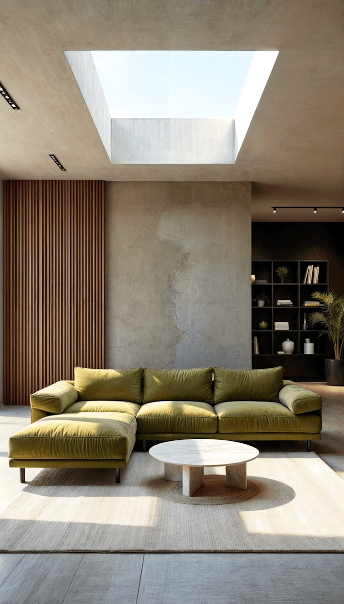
The static image library used across the site. Project photography lives in the CMS and changes with content, so it is not shown here.
For agents
Source new photography that could sit inside this grid without standing out: real interiors and architecture, natural light, muted and desaturated, no posed people and no strong color cast. Crop to the aspect ratio the layout needs rather than letterboxing, and keep images square-cornered like everything else. Never set copy on top of an image — the site always places text beside or beneath the photo. For anything project-related, pull the image from the Projects collection instead of uploading a static file.







09
Section patterns.
Across six page types the site reuses ten section shapes. Each one is defined by its vertical padding, its fill, and what the container holds. Building a new section means picking the closest shape here, not starting from an empty frame.
For agents
Pick a pattern first, then fill it. Vertical rhythm is the thing most likely to give a new section away, so keep to the alternation the site already uses: a tight 40px band sits directly beside a standard 128px band, and two standard bands never run back to back without a change of fill. Inside the container, a section header is always a Label eyebrow followed by a Heading 2, left aligned, in that order — Heading 1 is reserved for the page header and appears once per page. When two light sections meet, band the second one with Neutral 02 rather than adding a border between them.
The ten shapes
Page header
168px 0px 0px · Neutral 00
Opens every page below the navigation. Container holds a heading block: h1 plus a one-sentence lede. On the projects page it closes at 64px because a filter row follows.
Hero, full bleed
No padding · Neutral 09
Background image behind a container, followed by a matching Hero Placeholder spacer. Only the home page and the project detail page use it, and both are bespoke.
Hero, full height
128px 0px 96px · 85vh · Neutral 09
Opens a CMS detail page. The item’s Thumbnail sits behind the container as a full-bleed layer and the section is held at 85vh, so the hero fills most of the first screen whatever the headline length.
Image band
40px 0px · Neutral 00
One or two images spanning the container. Used to break up a run of text sections.
Content band
128px 0px · Neutral 00
The workhorse. Container holds a header block, then a list, grid or set of component instances.
Banded content
128px 0px · Neutral 02
Identical to the content band but tinted, so two light sections do not run into each other.
List section
40px 0px 128px · Neutral 00
Starts tight because a filter row sits above it, then closes with the full standard padding.
Closing section
128px 0px · Neutral 00
A Heading 2 and a related list at the end of a detail page, such as “More from the studio.”
Divider
No padding · Neutral 02
A bare filled frame with no container, separating a project body from the section that closes the page.
Contact
Component · Neutral 09
The Contact Section component dropped in whole. It brings its own 128px padding and dark fill.
Ordering rules
First section
Page header or hero
Never start a page with a content band — there would be no h1.
Tight next to standard
Always
A 40px band pairs with the 128px band beside it. Two tight bands only ever meet around an image.
Changing fill
Neutral 02 or Neutral 09
Use a fill change, not a border, to separate two adjacent sections.
Section header order
Label, then Heading 2
Eyebrow first, title second, both aligned to the container’s left edge.
Last section
Contact, then footer
The footer arrives from the layout template, so the last section you build is usually Contact.
10
Content model.
Four collections drive everything dynamic on the site. Projects holds the work and Project Type holds the filter categories the projects page runs on; Articles holds the writing and Article Category holds the filter categories the articles page runs on.
For agents
Render anything list-like from a collection, never as hand-placed copies on the canvas. If you need a grid or a list of projects, use a collection list bound to Projects and let it repeat; if you need a filter, bind a collection reference variable on the page to Project Type exactly as the projects page does. The articles pages work the same way: a collection list bound to Articles, filtered by a collection reference to Article Category. Do not add a field to a collection to solve a layout problem — check whether an existing field already carries the value. Thumbnail Type is the switch that decides whether a card shows Image Thumbnail or Video Thumbnail, so read it before you bind either one.
Projects — 9 items, slug field Slug
Featured
Boolean
Marks the entries that appear in the home page featured stack.
Name
String
The project title. Used as the card heading and the detail page title.
Brief Description
String
One line of supporting copy on the card.
Project Types
Multi reference → Project Type
Drives the filter on the projects page. A project can carry more than one type.
Slug
String
The URL segment behind /projects/:Projects.
Size, Year, Location
String × 3
The meta values on a project item, separated by 4px dot markers.
More Projects
Multi reference → Projects
Hand-picked related work for the closing section of the detail page.
Thumbnail Type
Option
Switches the card between the image and the video thumbnail. Always read this before binding either.
Image Thumbnail
Image
The still thumbnail.
Video Thumbnail
File
The looping thumbnail, used when Thumbnail Type selects it.
Video Poster Image
Image
The frame shown before the video loads.
Content-1 and Content-2
Rich text × 2
The two body passages on the detail page. Style them with the Rich Content presets.
Gallery-1 and Gallery-2
Array × 2
The image sets that sit after each body passage.
Project Type — 4 items, slug field Slug
Title
String
The label shown on the filter tab.
Slug
String
Used as the project-type query parameter on /projects.
Content
Rich text
Optional description. Not currently rendered on the site.
Articles — 6 items, slug from Title
Title
String
The headline. Used as the card heading, the detail page h1, and the home page featured card. The slug is generated from this field — there is no separate Slug field.
Description
String
One line of supporting copy inside the detail page hero. The Article card binds it too, but the thumbnail covers it, so nothing shows on the grid.
Thumbnail
Image
The landscape thumbnail: full bleed behind the detail hero, and the image panel on every card. Framer serves scaled renditions, so upload around 2400px and no larger.
Article Category
Reference → Article Category
Drives the filter on the articles page and the category label on each card.
Date
Date
Rendered as a medium date string beside the category.
Content
Rich text
The article body on the detail page.
Author, Author Details
String × 2
The byline name and role under the hero.
Avatar
Image
The author portrait beside the byline.
Featured
Boolean
Marks the entry the home page pulls into its Featured Article card.
More
Multi reference → Articles
Hand-picked related reading for the closing section of the detail page.
Read Time
String
Shown as a Label in the detail page hero, beside the back link.
Article Category — 4 items, slug from Name
Name
String
The label on the articles filter tab and on each article card. The slug is generated from this field.
11
Page scaffold.
Every page in this project is wrapped in one layout template, so a new page starts with a navigation, smooth scroll and footer already in place. What you build goes into the slot between them.
For agents
Create the page, leave the layout template set to the default, and build only the sections that belong in the slot — the navigation, smooth scroll and footer are already there and adding a second copy of any of them will break the page. Set the two page-level controls before you start: the navigation text colour and the footer theme. The two are independent of each other. Navigation text colour follows the page’s first section: Neutral 00 where the page opens on a dark hero, Neutral 09 where it opens light. The footer theme is a separate choice, and Dark is the house default — seven of the nine pages use it, including pages whose navigation is Neutral 09. Build the Desktop breakpoint completely before touching Tablet and Phone, then adjust only padding, column counts and component variants at the smaller sizes — never restructure.
What the template already provides
Navigation
Basic/Navigation
Sits at the top of every page. Its text colour is controlled per page, not inside the component.
Smooth Scroll
External component
Provides site-wide smooth scrolling. There must only ever be one.
Page slot
Placeholder
Everything you build goes here, as a vertical stack of sections.
Footer Section
Basic/Footer Section
Sits below the slot. Its light or dark theme is chosen per page.
Badge
Lunis Badge
The template credit. Leave it alone.
Page-level controls
Navigation text colour
Neutral 00 or Neutral 09
Set on the page, not on the navigation instance. Match the page’s first section: Neutral 00 on the home page, project detail and article detail, which all open on a dark hero; Neutral 09 everywhere else.
Footer Desktop
Light Desktop or Dark Desktop
Independent of the navigation colour. Dark is the house default — only the home and about pages use Light.
Footer Tablet
Light Tablet or Dark Tablet
Same theme as Desktop.
Footer Mobile
Light Mobile or Dark Mobile
Same theme as Desktop.
Layout template
Default
Leave it. Every page in the project uses the same one.
Build order
1
Create the page and set its path
Use a lowercase, hyphenated path. A CMS detail page takes :CollectionName as its slug segment.
2
Set the page controls
Navigation text colour to match the first section you are about to build, then the three footer variants — all three on the same theme, Dark unless there is a reason not to.
3
Prepare the Desktop breakpoint
It is a vertical stack with auto height. Sections go straight into it as direct children.
4
Build sections top to bottom
Section, then container, then content — one pattern from section 09 at a time.
5
Add the reveal
The fade from section 05, staggered 0.1s across sibling blocks.
6
Add Tablet and Phone
Adjust padding, column counts and component variants only. Do not restructure the tree.
7
Check against this page
Palette, type styles, spacing values, component usage and copy tier, in that order.